
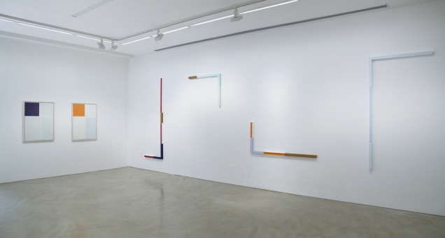
 View from "A Espessura da Cor"
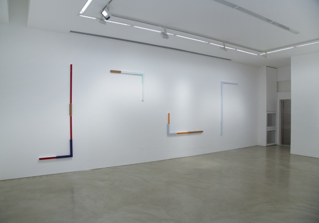
 View from "A Espessura da Cor"
 View from "A Espessura da Cor"
 View from "A Espessura da Cor"
 View from "A Espessura da Cor"
 View from "A Espessura da Cor"
 View from "A Espessura da Cor"
 A Espessura da Cor | Renata Tassinari
Renata Tassinari
From Mar 01 to Apr 14 2018
LURIXS: opens it’s 2018 program at the gallery’s new home at Leblon with a solo show by Renata Tassinari, "A Espessura da Cor" (“The Thickness of Color”), under Felipe Scovino curatorship.
Fifteen works were shown – ten paintings and five drawings (painting over paper) –, created between 2015 and 2017, in which one can see geometrical planes by colors on paper or acrylic structures in place of canvases, result of a research developed by the artist since 2003. At first sight, Tassinari works provoke doubt: are they individual, juxtaposed or continuous rectangles and squares?
Is the painting made over canvas behind the acrylic box or is the paint applied directly over the industrialized board that also serves as a protection? There is still the naked wood, without any paint, that interweaves the acrylic planes. Tassinari tells that the shape of her works has inspiration in urban architecture – facades, doors and windows, of straight lines and angles exclusively. The paintings structure drawing is transformed into acrylic boxes of five centimeters depth.
The intern part of those boxes is painted with acrylics and the external gains lays of oil paint, without overlapping. The contrast of the materials characteristics, the brightness of the acrylic board, the opacity of the oil at the outside painted plane plus the white string at the edges creates a volume, that projects the painted planes for space. The colors and materiality are the ones which provoke the impression of relief and depression, but the structure is absolutely flat. To the eyes of the observer, it’s almost magical what Tassinari can create with colors. And here it comes another autoral resource of the artist: she creates her chromatic palette and all the colors are welcome. None of them comes out of the industrialized tubes at art stores.
“To transmit this expansive character of color is definitely not something small. Transforming the color into something that magically comes forward the space and that in other cases, inside her work, concretely wins some thickness or folds, just like the case of the recent paintings that fabricate a image – as I wrote now – of fracture, are notable characteristics in the artist’s work”, praises the curator Felipe Scovino. Inside of what is gathered together in this exhibition, there is the series “Flashlights”, formed by acrylic modules painted and installed on the wall in parallel vertical and horizontal lines, that give the illusion of turned-on light stems. “From the flashlights, the works increased in it’s relation with space”, tells the artist. The most recent set if this show is called “Edges”, which are a development of the flashlights, with a more economic appearance in the form (narrower) and composition of colors (lowered tones). In the paper paintings, that Tassinari prefers to call as drawings, the plane is divided with lines of graphite in squares and rectangles. Some fields are elected for receiving oil paint with intense or soft tones. Both demonstrate a touch of lightness, as if the paper deserved a more fluid contact for it’s fragility.
Critics detect in the artist’s production a call for a more meticulous look from the observer, in contrast with the vertiginous dispersion of the world’s present moment. “In times of a accelerated inattention, the artist’s works take us to detain ourselves over the details and singularities of a gesture over paper, the thicknesses of oil or the white edge (the “work’s lung”, the gap in which runs the air) that travels thought the limits of painting over surface of transparent acrylic material”, resumes the curator Felipe Scovino.
About the artist
Gratuated in Arts by FAAP (SP), Renata Tassinari was a student of great masters as Carlos Fajardo and Dudi Maia Rosa and has dozens of individual and collective shows in her curriculum, including a retrospective at Instituto Tomie Ohtake (SP/2015) and solo shows at MAM RJ, MAM SP and Paço Imperial. Paulo Venâncio Filho, Rodrigo Naves, Lorenzo Mammi, Taísa Palhares and Laura Vinci are some of the critics, art historians and artists that had already wrote about her work.
The thickness of color | Felipe Scovino
I am always struck by the very personal way in which Renata Tassinari’s work explores the autonomy of color. By which I mean that color tends to part company with the medium, in the most diverse circumstances, and reach a virtual state, and more, because what interests the artist is the revelation, diagnosis, and problematization of the thickness of color. In her work, color achieves a materiality, a solidity, that makes it return – poetically, of course – to its embryonic state, meaning that, like thepigments, the artist’s finished works give color a corporeal state. WithTassinari, color is tactile, attractive, pulsating. This state should not necessarily be confused with the idea of craft. Notice, for example, howthe works created on acrylic frames are, most of all, smooth andhomogeneous painted surfaces. The ambiguous appearance of these color surfaces suggests a kinship with design and, simultaneously, with the most rigorous and original art practices, such as those of Brice Marden, Ione Saldanha, and Willys de Castro, in addition to Barnett Newman’s color fields.
However, the craft involved in the drawings – if I can call craft that shallow but potent layer of oil and graphite on paper – comes in the right measure: the applied color appears as something light, delicate, and soft. Neutral colors are preferred in the drawings (or might they be paintings on paper?), and accentuate these characteristics. Both in the drawings andin the paintings on acrylic frames, each within its own specificity, one finds different states of corporeity, measurement, and gesture. When standing before the paintings, the element of reflexivity that acrylic conveys to color incorporates us in the object. And, beyond this physical phenomenon, or even through it, we are plunged into an ambiguous and extremely relevant experience: on one hand, we experience the capacity for vivacity and memory that the colors expose – it is not inappropriate to think of Tassinari’s pictorial fields as landscapes, just as, for example, Mondrian’s grids also revealed the intense rhythm of the metropolis – and, on the other, we are confronted with a cold, cut-out panel. As the critic Rodrigo Naves phrased it in an essay on the artist, "we struggle to unify two phenomena that, for now, still seem to possess incompatible natures. This may be uncomfortable, but it is remarkably reminiscent of the life we lead." (footnote 1) In the case of the drawings, the precise gesture when choosing the amount of paint to be used, and the shape of the quadrant, that outlines the borders and the appearance of the chromatic fields, generate a particular condition: the colors appear to levitate, departing slightly from the plane, achieving tentative flight. This leap leads color to acquire autonomy from the paper, and reveals its thickness. It is no longer a pure illustration of the world, but begins to inhabit space. At that moment, its sensitive statute appears heightened, rather than its compositional role. Color is no longer part of a drawing,but has an autonomous personality when occupying its area on the plane. And this condition – one independent of the support, I would emphasize – creates a new temporal relationship between the viewer and the work, since the latter slows the former’s gaze down; we are led to perceive color as an "intrinsic quality, not a relation," (footnote 2) as Mammì emphasizes.
I would like to revisit something mentioned earlier that, I imagine, does not usually come to mind when thinking of Renata's work. It is the legacyof Ione Saldanha. If Aluísio Carvão, with Cubocor (1960), and Hélio Oiticica, during the 1960s, with the Bólides and Parangolés, brought color to a state of immanence hitherto unseen in Brazilian art, Saldanha exposed the physicality of color using small slats. Therein lies the leap of color into space. I don’t think there is a question of direct influence – the relationship between Saldanha and Tassinari – but of two poetics that were able to articulate painting, lyricism, aesthetic pleasure and, above all, the autonomy of color. Saldanha's slats, bamboos, and spools all have a raw quality, an "awareness of certain folk art patterns whose decorations infuse daily life" (footnote 3), as well as a craft aspect that covers different ground from Tassinari’s, in whom one perceives a cleaner and more concise finish in the use of materials. However, my attention is drawn to the manner in which both these trajectories was based on constructive rigor and chromatic sensitivity. There is, in each, on the margin of spectacle and the flood of information, an unusual mixture of informality and unpretentiousness.
I would like to stress another ambiguity in Tassinari’s poetics that only increases its potential: the artist combines a precise, economical, and minimalistic repertoire of material resources with a maximum of expressive and lyrical means. In times of accelerated inattention, herworks would have us dwell on the details, the minutiae, and the singularities of a gesture on paper, the thickness of the oil, or the white border (the "lung of the work," the line through which air passes) that outlines the painting’s boundaries on the transparent acrylic surface. In her work, experiments on paper and canvas have always happened concomitantly. At the beginning of her journey, still in the 1980s, the use of cut wood and sandpaper already exhibits this quality of materialpulsation – of it moving away from the plane and into space, as if the canvas, no longer able to contain the quantity of relationships established (with color, form, and its own structure), swelled and began to vibrate. This relationship is maintained in the works on paper, where it is color that stimulates this vibration. It is color-light, one that vibrates so intensely that the support on which it finds itself soon appears inadequate, unable to contain this experience within its limits, so that, ultimately, color expands beyond the support. This is one more aspect of this operation of transmitting thickness to color. The paint, the material that gives body to color, phenomenologically transmutes itself into skin. There is a slight haze that shrouds the surface and, especially in the drawings, lends texture to the paper. The perception of textures, sensations, bodies, and skins in the painting makes our eyes more sensitive to the world. It reduces the harshness and incomprehension that surround us, and makes us become, even if involuntarily, blind to the atrocities of daily life.
As I wrote earlier about her work (footnote 4), the canvas and the paper, little by little, but in a consistent and precise way, are no longer meresupports for the painterly act but become constituent parts of the work itself. The use of collage, wood cutouts, and, later, acrylic frames, concealed by the paint to achieve a trompe l'oeil or trick image, manifest the idea that it is there, in the sacred space of painting itself, utilizing the elements that give it form, that painting brings itself into being. Perhaps Tassinari’s work is not, after all, the kind of painting that dialogues with constructive poetics, but, rather, deconstructs it.
If, in recent years, Tassinari’s production has engaged the materiality of painting with thick brushstrokes – a texture often resulting from the use of encaustic –, what seems to interest her most in the current phase is what I have been calling the thickness of color. The mass of gestures and tones is replaced, to a certain extent, by precision and meticulousness, especially in the paintings on acrylic frames.
Tassinari’s most recent paintings interact with space through fractures or fault lines. These are like indefinite boundaries, open edges, broken frames. They become categorically confused with space, because the plane has already been conquered. These are forms that come across as threads of light. If you examine the limits of the acrylic frame paintings, you will see that they are not exactly limits; they are, rather, magnetized surfaces that gently take hold of space. But, unlike much of the concrete and neoconcrete antecedents, this leap into space is achieved through color, not through form. Here, once again, the poetics of Carvão and Oiticica emerge, though I would clarify that the specificities of each of these artists are very different from Tassinari’s. For instance, Oiticica conceives color as a (metaphorical) body, that even becomes confused with another (real) body, and is crossed by it. Think of the spectator’s exploration of the Penetráveis (Penetrables) and how those labyrinths, nests, doors, and monochromatic beams are traversed, touched, smelled, and appropriated in the most diverse sensorial ways. In Renata's case, color doesn’t want to be mistaken for a body, at least not in Oiticica’s sense, but wants a place of its own, one that reflects autonomously on its properties. One takes note of their independence from the plane, theirfalse condition of apparition, because color is transforming itself into light, a kind of chromatic field that advances beyond that area in which it is graphically located. It is the white edge of the acrylic border, which the artist leaves visible, that confers a slight volume to the surface of the painting. And this state promotes an illusion in the spectator’s eyes, provoking an alternation of positions between figure and ground. Painting reveals this constant transitory state.
It is no small feat to impart this expansive character to color. Turning itinto something that magically advances into space and, in other examples, concretely achieves a depth or a fold, as seen in the recent paintings that form images of fracture, as described above, are notable characteristics ofTassinari’s work.
Another internal logic of her paintings is the way in which they bring visibility to architectural spaces, or everyday objects, transposed into an abstract-geometric language, as in the Lanternas (Lanterns) series. The acrylic modules are arranged vertically, side by side, separated by short intervals, while the surface, painted in monochromatic acrylic and oiltones, conveys the sensation of a glowing light stick. Color, in this series,has volume, density, and thickness. The title also encourages us to think about this very particular relationship between light and color that characterizes Tassinari’s work. This series synthesizes the artist’s practice, since color, here, is vibrant matter that wants to extend into space.
NAVES, Rodrigo. Renata Tassinari: color and the dilemmas of experience. In: TASSINARI, Renata. Renata Tassinari. Rio de Janeiro: Francisco Alves, 2009, p. 13.
MAMMÌ, Lorenzo. [Untitled]. In: TASSINARI, Renata. Renata Tassinari. Op. cit., p. 33. Originally published in Renata Tassinari, exhibition catalog, Galeria Millan, São Paulo, 1989.
OSORIO, Luiz Camillo. Ione Saldanha: time and color. Curitiba: Oscar Niemeyer Museum, 2013, p. 23.
Cf. SCOVINO, Felipe. [Untitled]. In: TASSINARI, Renata. Renata Tassinari. Rio de Janeiro: Múltiplo Espaço Arte, 2014. Exhibition catalog, w/p.
Felipe Scovino is a professor at Escola de Belas-Artes da Universidade Federal do Rio de Janeiro. He also works as an art critic and curator.